Appstore On FirePhone
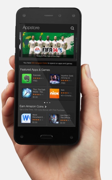
Overview Being my first project after being hired at Amazon, this was quite a heavy responsibility. This project was much different from standalone Apps I had designed in the past due to the fact that it was part of a larger ecosystem - FirePhone’s core platform. I had to work within the bounds of the platform rules, while simultaneously trying to influence those rules through my own efforts. It required constant collaboration and negotiation between myself, product, Kindle platform and Appstore leadership. I was responsible for creating and delivering executive level presentations, which required me to speak to both my design decisions and platform’s design decisions and how they impacted the Appstore experience. These presentations were given at a Director level, VP level, SVP level and ultimately to Jeff Bezos for feedback and approval. Although not a commercial success, the FirePhone served as an amazing design experience that prepared me for larger things ahead.
CompanyAmazon RolesLead UX Designer, VXD, IXD, IA, User Researcher Year 2013 - 2014
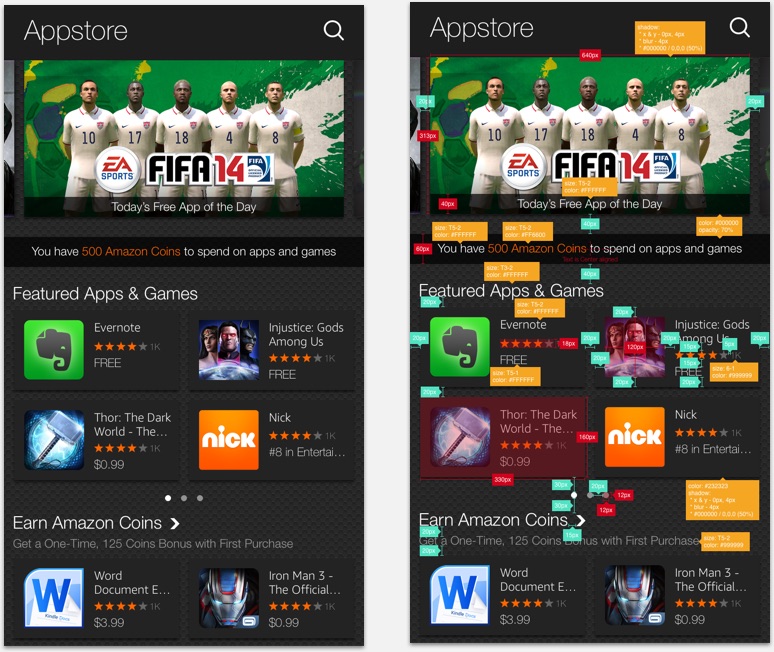
Gateway To assist with the layout of the app icons, I housed them in a tile. This was the first time this had been done on the Appstore gateway, but allowed a more organized and clean layout. In the past, due to all the varying shapes of the app icon, the Appstore gateway tended to feel cluttered and disorganized. The tile background helped to clean things up, while also giving a clear tap target and provided additional room to contain ratings and pricing information.
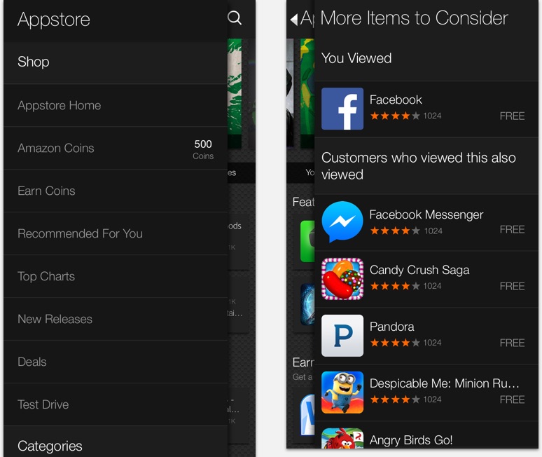
Left & Right Panels The FirePhone had a “tilt” gesture which would cause things to happen on the phone. The phone could distinguish between a slight tilt and a more exaggerated tilt. For a more exaggerated tilt, the phones UI surfaced panels. A tilt to the right would open a left panel, and tilt to the left, would open the right panel. The left panel was reserved for navigation within the Appstore, however, the right panel was up to us. We felt strongly that this panel should be used to expose personalized information or ranked information depending on the section of the Appstore you were located in.
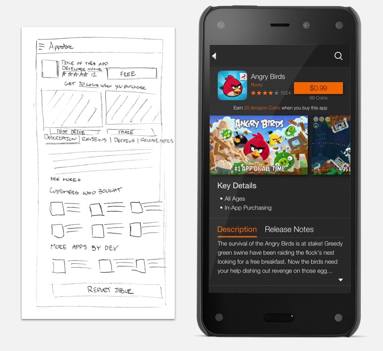
Detail Page The biggest challenge with the detail page was the sheer amount of information contained on the page. It was a challenge to surface both the pertinent information to the customer for making a purchase decision, and the information that legal required (aka Key Details, Release notes). Through dozens of iterations and gathering internal feedback (External user research was not allowed due to the confidential nature of the project) I finally landed on the design shown above, which contains a condensed header, large images to expose the rich artwork, legal info, and the first four lines of the description above the fold. Even in large font mode, the description tab remained above the fold.
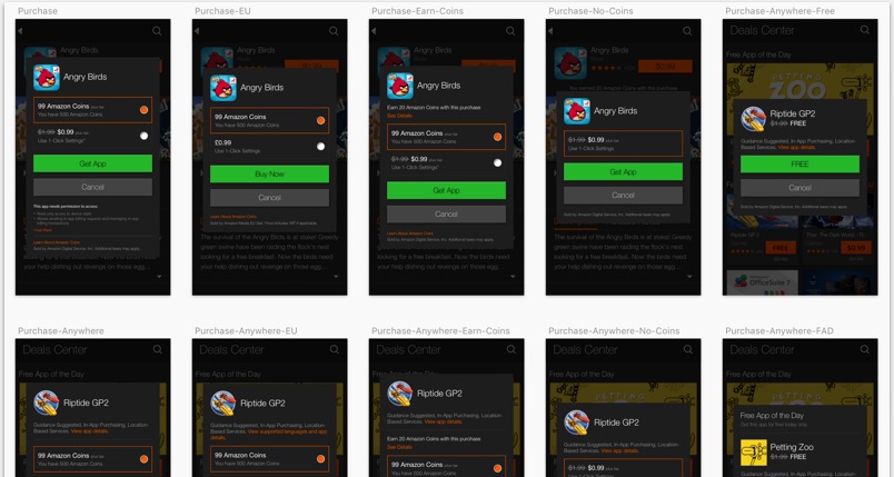
Purchase Dialogs Purchase dialogs were a tedious task. Not only did I have to figure out how to keep the clutter down, but there were so many variations depending on Free vs Paid vs International vs promotion, etc, etc. The key was to layout the screen with the maximum amount of information it might contain and then work backwards from there. This way I ensured that now matter what the content combination was, it would all still fit.

Launch Poster This was a fun little launch poster I put together for display in the office hallway and was signed by all who helped on the project.